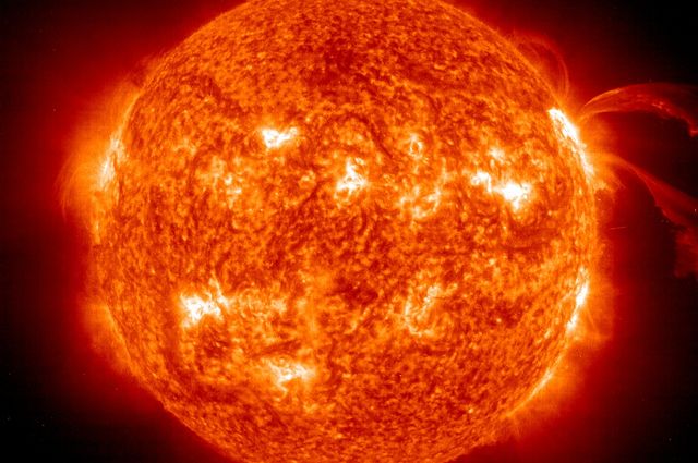
Meet the sun: a G2 class star towards the middle of its lifespan.
Wait a second…G2? What does that even mean?
It’s all part of a way astronomers break down the billions of stars in the sky and organize them by temperature. They can use a star’s spectrum to figure out what it’s made of, and that helps them figure out how hot it is.
But really…being able to read stellar spectra (plural for spectrum) is only so helpful. There are billions. It helps to have an organizational system.
That way, if an astronomer sees a stellar spectrum that looks a certain way, they can know immediately that it’s a certain class of star.
So…how exactly are stars classified?
Back in the 1890s and 1900s, astronomers first began to tackle this problem. They had billions of stars to analyze, and they weren’t all that different from one another. These astronomers wanted a way to group the stars, so they could stay organized.
Now, in our middle school math classes, we learn all sorts of ways to organize data. I’m particularly fond of the box plot, which displays a range of data and helps us see how spread out it is.
But stars aren’t numbers on a page or screen. They’re…well, their data looks a lot like this.

I think I sort of gave away the answer with this image. But maybe you haven’t caught it yet…if you’re not familiar with Kelvins, it’s a bit subtle.
So, in the 1890s and 1900s, there was one particular astronomer named Annie J. Cannon who was dedicated enough to personally examine these spectral data for over 250,000 stars.
I really hope she got credit where it was due—that’s a lot of stars. And she did this before any sort of organizational system was invented.
Cannon took those hundreds of thousands of stars and managed to narrow them down to just 17 categories. She labeled them A through Q, in alphabetical order.
Over time, those 17 categories have been edited a bit. Some have been dropped, some merged with others, some rearranged. And what we’re left with are the basic 7 classifications, in no way alphabetized—O, B, A, F, G, K, and M.
Now you get what I mean about our sun being a G2 class star.
Or…you get the “G” part. Where’d the “2” come from?
Well…like I said, there are billions of stars. Dividing them up into 7 categories is helpful, but it’s not precise enough. Each one of these categories is divided into subcategories—the numbers 0-9. Now we can know a star’s temperature to an accuracy of about 5%.
So, the image up above shows those categories. Each spectrum contains black lines—absorption lines—typical of that class of star. On the right, you see their temperatures listed in Kelvins—just Celsius plus 273°.
As you can see from the numbers, whether you’re familiar with Kelvins or not, it looks like stars get hotter from M to O. And you’re right, they do.

Yeah…they also get bigger. And change color. But we’ll talk about that later.
For now, just realize that the order of the spectral classifications matters. O is the hottest, M is the coolest. If our sun is a G2 star, it’s sort of on the cool end of the scale, but it’s hot for a G-type star.
So how do astronomers remember the order? It’s not like it’s alphabetical.
Our strategies are kind of funny, actually. We’re human beings just like the rest of you. And we have a couple of funny mnemonics.
The oldest is “Oh, Be A Fine Girl/Guy, Kiss Me.” And of course, astronomy students more recently came up with “Oh Boy, An F Grade Kills Me.” My personal favorite is “Only Bad Astronomers Forget Generally Known Mnemonics.”
What’s funny to me is how well they fit. No weird shuffling of syntax or ignoring parts of the sentence. And the girl/guy thing works perfectly…it’s almost as if this classification system was designed to make it easy for us.
Here’s a slightly more detailed diagram of stellar spectra, according to star type.

This shows more star types than just the seven O-M—it shows a few intermediate classifications as well. You can see, when these spectra are arranged from hottest to coolest, how they make sense.
Notice the way those black lines fade in and out pretty evenly? That’s not an accident. It shows a gradual change in the star’s composition as we look at different temperatures of stars.
Specifically, notice the H𝛼, Hβ, H𝛾, and H𝛿 lines. (You’ll find them labeled at the top of the spectrum; they’re the darkest and most obvious lines crossing through star types B2-F0.)
These lines are called Balmer lines and are produced only in stars of the right temperature; the star can’t be too hot or too cool. A-type stars show these lines the strongest.
But notice that at the bottom of the spectra, we only see lines produced by heavier materials. TiO, for instance, isn’t an element—it’s a molecule, and it can only survive in much cooler stars where collisions between atoms won’t strip it apart.
It’s to be expected that these lines are the darkest—the strongest—in only the coolest stars, specifically K-M.
This is not how astronomers usually examine stellar spectra, though.

I’ve mentioned before that astronomers prefer to display spectra as a graph of wavelength vs. intensity. What you see here shows you the same information as the rainbow up above.
On the rainbow, the lines represent where elements in the star’s atmosphere have absorbed and scattered certain wavelengths of light—so we just see a dark line instead of that color wavelength.
On the graph, wavelength is on the horizontal axis and the intensity of that wavelength is on the vertical axis. Dramatic dips in the graph represent spectral lines.
You can see here how the graph displays data that’s harder to see on the spectrum. It shows us little dips in wavelength intensity that our eyes can’t necessarily pick out among the colors of the spectrum.
Spectral classification is an ongoing study. We haven’t seen all there is of the universe, so naturally, there are bound to be other types of stars not represented on this graph. We’ve already discovered a couple—L dwarfs, T dwarfs, and Y dwarfs.

These guys are…well…let’s just say, they’re not quite stars and they’re not quite planets.
You’ll find, as we delve deeper into astronomy, that there are rarely distinct differences between similar objects. The electromagnetic spectrum—the spectrum of all light and radiation—represents a gradual change in wavelength from radio waves to gamma rays.
The spectrum from planets to stars is no different. Jupiter itself shares qualities with some not-quite-stars, and isn’t too far from being big enough to begin hydrogen fusion. That would make it a star.
L dwarfs and T dwarfs are too cold to really be stars as we know them. But they’re not planets. They’re something else…something mysterious.
We’ll revisit these cosmic anomalies in future posts—when we start exploring our galaxy a bit more.
